Friday, 22 November 2013
Rationale
My contents page will have an image of my front cover but it will be small. It will have arrows from the articles that are on the front cover and it will have the page numbers that they are on. I am doing this because lots of Pop music magazines do it and I think it looks good on a contents page. I am having a little box in the corner with other page numbers so readers know what else is in the magazine. I will also have more information on what you can win and how so readers know what to do. There will also be some pictures of either existing celebrities that I have taken at concert or the one on my front cover. This will make my contents page more interesting.
Wednesday, 20 November 2013

Friday, 8 November 2013
Fonts and Colours
I have decided to use the font Impact for my masthead. This is a bold yet simple font. The font can also be made to look more bold using shadows. I am using this font because I am adding hearts around it therefore if it was a more bold font it may look a bit too much.


I am changing the colour of my masthead from black because that colour is too dark for a pop music magazine. I am changing the colour to pink because it is more of a girly colour and you would expect to see that colour on a Pop magazine. I am changing my masthead to pink for that reason but also because a lot of my target audience said that was their favourite colour so if the masthead is pink it might attract them more.
Wednesday, 6 November 2013
Pitch
My magazine is going to be a Pop music magazine. The colour palette will be quite bright, girly colours such as pink and yellow. The costume will be something bright and girly like a dress. I chose these colours and costume because these are the things that my target audience will like. There will be a double page spread that will be a question and answer interview with a famous singer. I want my magazine to look quite bright and fun so it stands out which will make people want to buy it. I will take my photos in the studio because I want my magazine to look professional and I want a plain white background. The white background will help the magazine from looking too bright and bold and if it was, it would stop people from buying it.
Monday, 4 November 2013
Flat Plan - Front Cover

This is the flat plan for my front cover. This will help me because I will know where everything needs to go when I make my front cover.
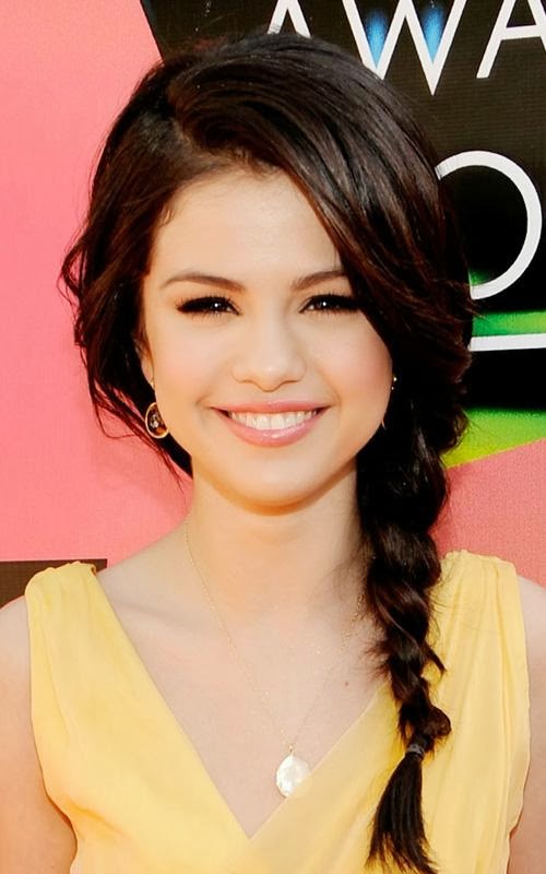
Hair Ideas

The curls are lose which makes it look a little relaxed. This hairstyle looks like it will be quite easy to recreate.

This hairstyle looks like it is quite easy to do but it looks like it might be hard so it looks more put together.
This hairstyle looks quite simple yet nice.

This hairstyle looks really nice and sleek and it will be really easy to do.

This hairstyle will be quite simple to do and it looks nice and fun.
Subscribe to:
Comments (Atom)